 .....
..... .....
.....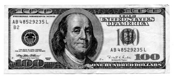
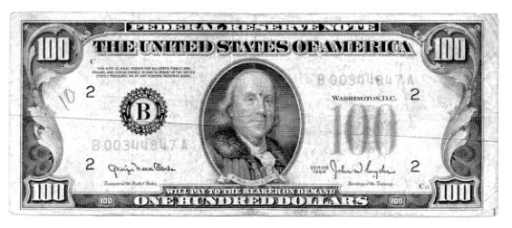
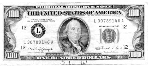
Some of us keep studying these matters of what passes for "money" and know exactly where it is all going. You might actually be able to recall the past 10 years when the federal reserve NOTES (wrongly called money) were changed. Less than 10 years ago, there was a lot of ceremony regarding the introduction of the new Federal Reserve "100" note (commonly called 100 dollars). Most every media announcer correctly called them "notes", but it is doubtful that many people were paying attention.
In September, 1995, ABC reported (no doubt as scripted by the Federal Reserve) on the new "C" note, saying the new note represented the first change of the "C" note in 66 years. Then on March 26, 1996, ABC news reported (no doubt as scripted by the Federal Reserve) that the new note is the first major change in nearly 70 years. And then again, on March 27, 1996, KATV, Little Rock, Arkansas TV channel 7, on their morning news show reported that the new note is the first drastic change. Excuse me!
A change from something to nothing is an extremely major change and it had already occurred in the past 45 years. In other words, the Federal Reserve note used to be redeemable for money, then over a period of years circa 1913 to circa 1963, they started NOT being redeemable for money, essentially becoming a fiction, a fraud, a debt instrument. But of course, such an ancient change is insignificant compared to new high technical changes in the appearance of these debt instruments - humbug.
Do we see a pattern? Are they setting a stage for some as yet undisclosed event, or is all this simple brainwashing, doublespeak, Orwellian rewrite of history, testing of the people for a soon-to-come major event? The following are 3 images of "C" notes from 1950, 1990 & 1996.
This new story was reported in May to those paying attention, and example is found at http://www.rense.com/general25/dedl.htm
..........
The last time Andrew Jackson got a makeover, he ended up with a slightly off-center big head, seen here. Coming in 2003: color.
Color is coming to U.S. paper money 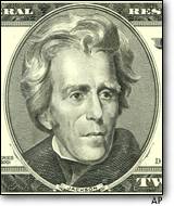
http://www.msnbc.com/news/841864.asp
contributed by Craig
New designs will start with $20 bill
ASSOCIATED PRESS
WASHINGTON, Dec. 1 The last time Andrew Jackson got a makeover, he ended up with a big head, slightly off-center. This time, he will get a little color. The most noticeable features of the last redesign of U.S. currency the oversized, off-center portraits produced all kinds of derisive nicknames: funny money, Monopoly money, cartoon money.
COLOR IS COMING, and government money makers are hoping for a warmer reception for the changes. The new $20, with its public unveiling set for the spring, is supposed to be in circulation as early as next fall.
Jackson is first in line for a makeover. After the new $20 makes its debut, the new $50 (Ulysses S. Grant) and the $100s (Benjamin Franklin) will follow in within 18 months.
In the works is a five-year effort, costing up to $53 million, to educate people about the changes. An important goal is to help distinguish between genuine greenbacks and bogus bills.
If we learned anything from the issuance of the $20 in 1998, it is that things that we get used to here, because we see it and work on it, when it is first in the hands of the public it is seen as dramatic, said Thomas Ferguson, director of the Bureau of Engraving and Printing. Suddenly, we are asking them to accept something else.
Portrait engraver Thomas Hipschen, who is working on the current redesign, remembers spending countless hours during the last makeover meticulously cutting into steel by hand the portraits of Jackson, Franklin and Grant for the new bills.
Relieved at first when the work was done, he then worried about the public reaction to the changes.
You worry about what the press is going to do, he said. I have an old clipping file about all the horrible things they said about the portraits that I engraved. Some fun things, too.
Everyone is a critic.
Well, you are not going to please everybody. This is a situation where everybody is going to weigh in on it, Hipschen said. You really have to have a thick skin, I think. But I dont really take it to heart that much. When my artist friends come back and say, What were you thinking? that kind of hurts to the quick. But the general population, they are going to get on the bandwagon, one way or the other, and Im just going to have to live with it. TECHNICAL CHALLENGES
To give the new bills color, the bureau has had to buy five printing presses, to operate in Washington and at a bureau facility in Fort Worth, Texas. To run the new presses, Ferguson said, some existing workers are getting trained, and a few new people have been hired. The Fort Worth plant is being expanded, providing room for the new presses and space for public tours, he said.
Adding color to the notes is a challenge.
It is new, and anything that is new provides another opportunity to do well or not, Ferguson said. There can be color variations that we wouldnt get with a single color ink, like when we use black or green. So there are additional inspection requirements.
Green and black ink is now used on neutral-colored paper. With the makeover, color tints will be added in the neutral areas of the note. Ferguson would not say which colors will be used, but said they will vary by denomination.
Money makers want the new notes to have an American look and feel, and not be confused with, for instance, the colorful euro, the paper currency of the European Union.
When we look at something as fundamentally revolutionary as adding color, going from a currency system that has been monochromatic certainly for all of our lives, our parents lives, ... we want to do it in a responsible way that recognizes that tradition, Ferguson said. So that when people around the world see that first new U.S. $20, they will know it as a U.S. $20. CONTINUUM OF DESIGN
Recent changes in paper money design have been driven by the desire to thwart high-tech counterfeiters. Over the years, counterfeiters have graduated from offset printing to increasingly sophisticated color copiers, computer scanners, color ink jet printers and publishing-grade software, all readily available.
Some anti-counterfeiting features included in the last redesign will be retained, the bureau said. They include watermarks that are visible when held up to a light; embedded security threads that glow a color when exposed to an ultraviolet light; and minute images, visible with a magnifying glass, known as microprinting.
The new notes may sport more distinct color-shifting ink. In the last redesign, color-shifting ink that looks green when viewed straight on but black at an angle was used in a spot on some notes.
Even after the greenbacks last makeover, which started with a revamped Franklin on the $100 in 1996 and ended with new $5s and $10s in 2000, some collectors still complained that U.S. currency is boring.
Ferguson has a different take.
Our notes now, in the highest sense of the word, are utilitarian, he said. U.S. currency is a continuum of design, versus a revolution of design.
Under the redesign, the size of the notes will not change and the same faces will appear on the same bills. But the portraits and buildings may be presented differently.
Hipschen said if he were king for a day, he would put Duke Ellington on one of the bills, would replace all the portraits with different American figures and would make notes longer as they increase in denomination.
We could have gone where no man had gone before, he joked.
© 2002 Associated Press. All rights reserved.
[this was presented w/o permission, yet due credit is given]